


Pursuant Health
Increasing User Retention in a Health Kiosk
SPONSORED BY
Pursuant Health
MY ROLE
UX Researcher + Designer
TIMELINE
4 months
TEAM
Ashlyn, Mandy, Mili
PROBLEM
Pursuant has over 4600 kiosks across the US and their kiosks have delivered over 275 million screenings so far. Their kiosks provide free and accessible health screenings through a national network of FDA-cleared medical kiosks.
95% of users don't create accounts on Pursuant's 4,600 Health Kiosks, preventing long term engagement and data tracking

So, Pursuant Health gave us a challenge:
How might we design a seamless and secure onboarding experience that encourages users to create accounts and continue to return to the kiosk?
SOLUTION
A Redesigned Onboarding with New Phone-Friendly Methods
The result of around 4 months of UX research and design was a redesigned onboarding system, a new QR code phone login, and a 1 step log in for returning users using their mobile wallet
ENCOURAGES USE
Shows users the value of the using the kiosk on the welcome page
Uses intentional color contrasts, reduces visual clutter and streamlines the onboarding options
THE OPTION TO USE YOUR PHONE
Our user research showed that users feel more comfortable inputting information with
QUICK ACCESS USING APPLE WALLET
Shows users the value of the using the kiosk on the welcome page
Uses intentional color contrasts, reduces visual clutter and streamlines the onboarding options

USER RESEARCH
4 months, 5 user research methods
Each user research method focused on the solving the core issue of user retention.
6 papers analyzed
4 hours total
8 interviews
16 responses
2,267 responses
LITERATURE REVIEW
My role: I led this part and analyzed 6 papers and noted the key findings.
Here's what we learned:
The medical/health kiosk market is experiencing robust growth, projected to reach $1.8B by 2028.
(Grand View Research)
Usability evaluations were reported in only 20.1% of academic papers on health kiosks.
(Maramba et al)
Virtually no studies on medical kiosks assessed adherence to accessibility standards.
(Bhutani et al)
Research in adjacent fields, such as mobile health apps, shows that UX is a key factor in driving adoption and usage.
(Lemon et al)
Literature showed us that the medical kiosk boom in the US has a critical flaw: A systemic neglect of user experience
FIELD OBSERVATIONS
To gain a deeper perspective of how users interact with these kiosks we observed users interacting with the kiosk at select Walmarts. We developed a semi structured protocol for these sessions and asked users a some questions after their sessions.
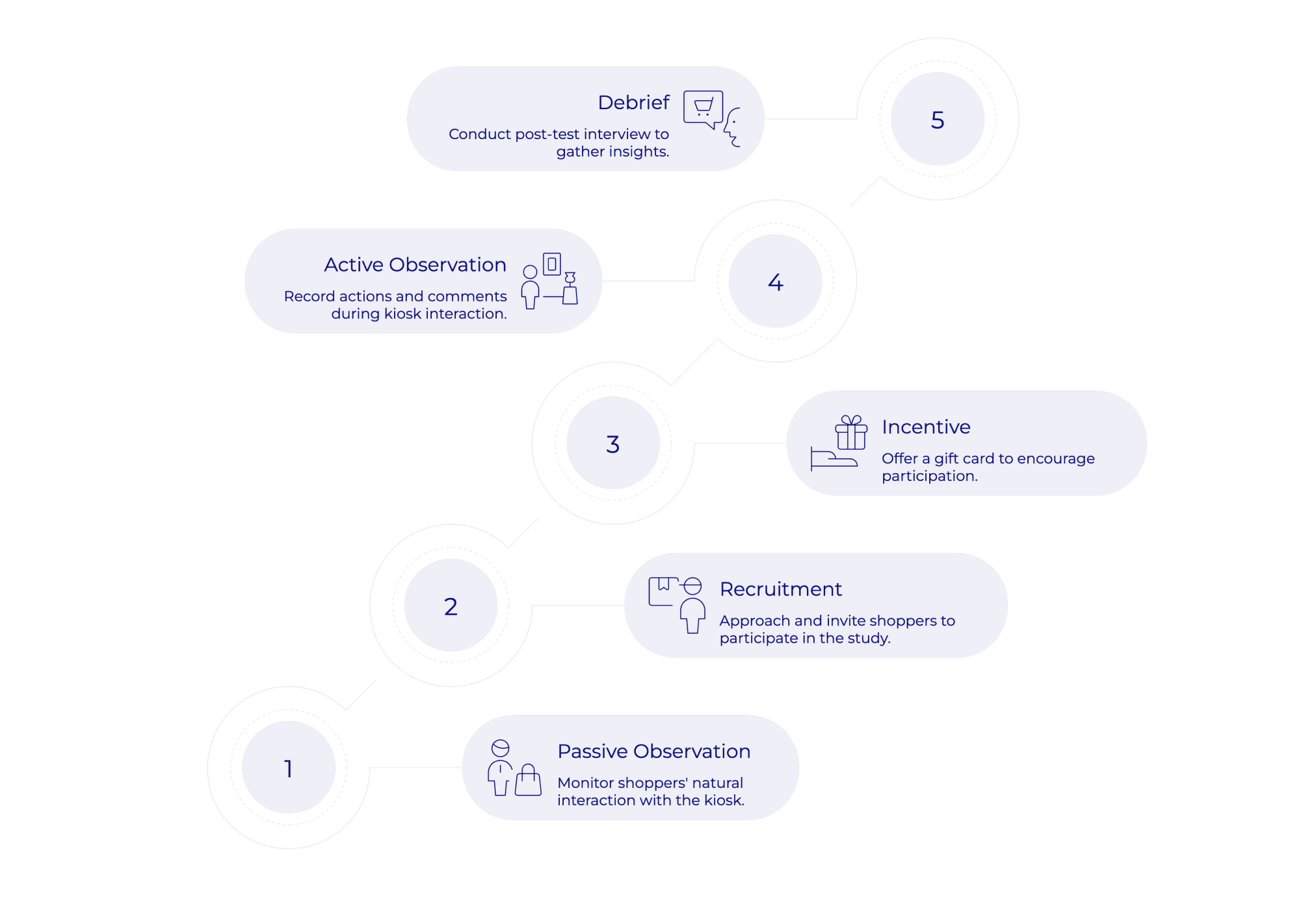

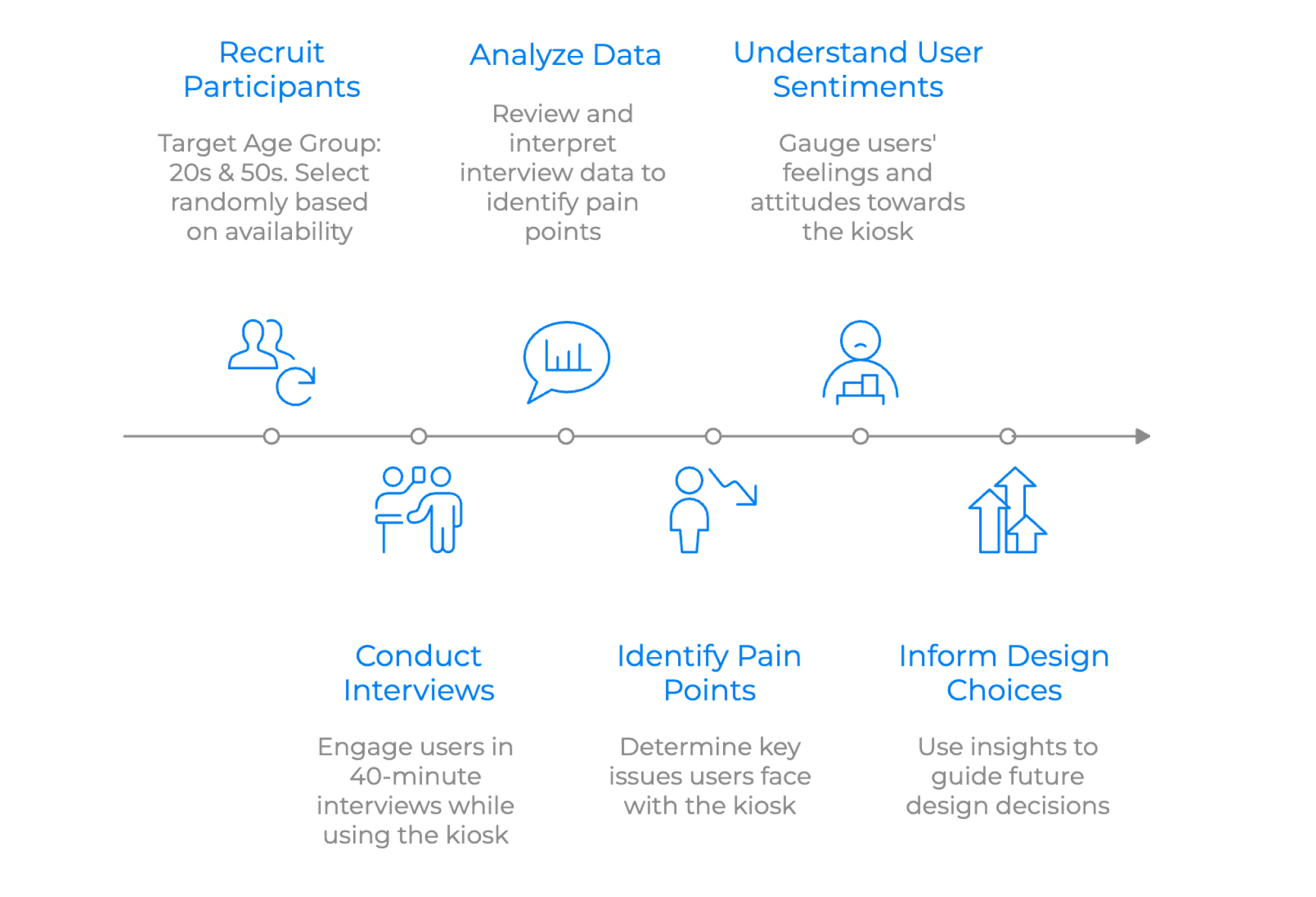
CONTEXTUAL INTERVIEWS
My role: I conducted 2 contextual interviews
Contextual interviews gave us a insights into user journeys, preferences, and pain points.
We analyzed our findings from the observations and contextual interviews on to an affinity map:

Users are concerned about sharing personal information and too many steps in the process discourages use
KIOSK SIMULATION HEAT MAP
My role: I led this method and created the heat map survey
We simulated the kiosk interface on a survey and tracked where users tend to tap to learn more about user behavior.

Users choose guest option because they are not sure what the alternatives entail or how long the process might be to sign up
EXIT SURVEY ON USER PREFERENCES
Pursuant helped us deploy an exit survey to 500 random kiosks across the nation where we got a large sample size to understand user preferences.
My role: I helped formulate the questions on the survey
There's an even split of preferences for signing up with email or phone. Users feel more confident entering information on their phones.
COMPETITIVE & COMPARATIVE ANALYSIS
We analyzed Pursuant's key competitor, Higi and analyzed McDonalds' kiosks and Withings, a health tracking app.

Competitors heavily use persuasive language to motivate users and push opportunities to create an account once users have experienced the benefit of the service.
DESIGN PHASE
We sketched, prototyped, and evaluated concepts based on user needs and design implications
It started with identifying design implications.
USER NEEDS AND DESIGN IMPLICATION
We identified 5 key needs and set implications based on those.

BRAINSTORMING AND SKETCHING CONCEPTS
We identified 5 key needs and set implications based on those.

DESIGN SYSTEM
We identified 5 key needs and set implications based on those.

PROTOTYPING
We identified 5 key needs and set implications based on those.

EVALUATE
We evaluated our prototypes by users and experts using SUS metrics and Cognitive Walkthroughs
It started with identifying design implications.

FINAL OUTCOME
We iterated based on the evaluations and finalized our prototype.
Try out the final Figma prototype below:
Other Projects


Explore the full archive →